ssslither
A modern gay meetup app for singles, couples & thirds.
Discreet and consent-first, with an editorial serif voice that sets it apart from the sans-serif hookup grid. This page is how the mark, the color, the type and the tone hold together. Everything shown live is drawn from the product itself, not a mockup.
The Mark
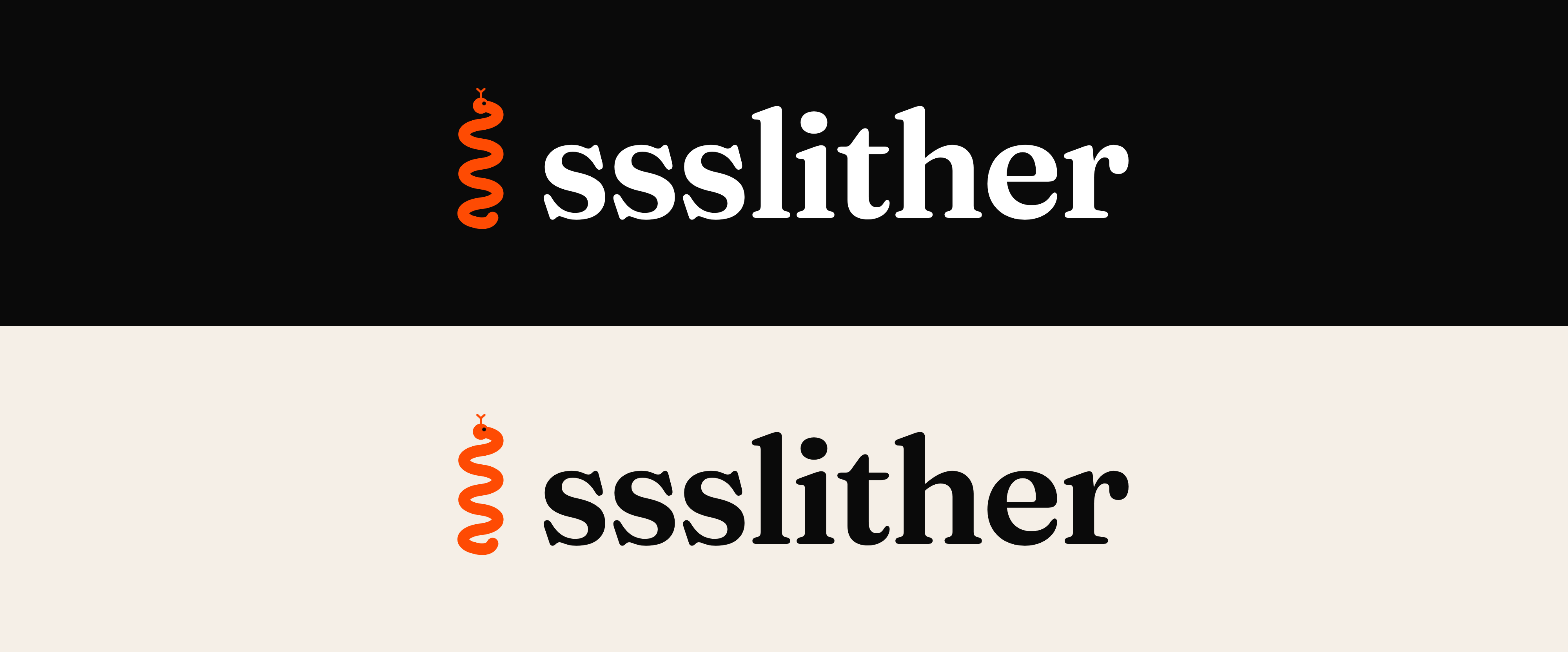
One snake coils into three S shapes, the sss of ssslither, with an eye and a flicking forked tongue. It pairs with the lowercase Fraunces wordmark. The snake carries the color and the word stays neutral.
Primary lockup
Elements and variants
Sizing and spacing
Clear space
Keep clear space of at least the height of the mark (x) on all four sides. Nothing else sits inside it.
Minimum size
ssslitherDo not set the full lockup below 20px tall. Below that the snake stops reading, so use the mark on its own instead.
Misuse. Do not do these
components/Brand.tsx, the same component the app header uses. Never trace or re-draw the snake. If you need it as a file, take the vector from the downloads below.Color
Blood orange on near-black is the whole identity. Everything else supports it: a lighter orange for glow, mint as a rare secondary spark, and true purple used almost never.
The ground. Every app and marketing surface sits on it.
Soft orange for links, hovers and highlights on dark.
Secondary spark. Success states and the occasional pop.
Rare. Written as the hex, never as a violet- class.
Body text and the wordmark on dark, stepped down with opacity.
Not an app color. The warm ground we place the light lockup on.
Orange ramp the working scale, exposed in Tailwind as violet-*
Typography
An editorial serif for anything that speaks, a clean system sans for anything that works. The serif is the personality and the sans gets out of the way.
Once they accept your message the chat opens, for both partners if it is a couple. Set running text around 60 to 65 characters wide and let it breathe. The sans never competes with the serif, it just carries the details clearly.
#fe4b03 · NEXT_PUBLIC_MOBILE_PHOTO_HERO · --font-serif · 20px
Reserve mono for values, tokens and measurements. The working numbers, not prose.
Voice & Vibe
Grown, warm, a little after-dark. Confident without shouting, playful without being crude. It sounds like a friend who runs a good room, not a billboard.
The feeling
Copy rules
The wordmark and the name in copy are always lowercase. Recast the sentence rather than capitalising it, and only use Ssslither where a capital cannot be avoided.
Never call it premium in anything a member reads. The plan has a name and the plus is part of the mark.
One deliberate exception lives in the homepage demo chat. Everywhere else, none, including marketing pages and email.
In buttons, labels and short product text, restructure the line instead of reaching for a dash.
Reaching out is a request. The chat opens when it is accepted, never before, and the copy should always say so plainly.
Thirds belong in the sentence, not tacked on at the end of it. The ampersand is the serif showing off, so let it.
Naming & Handoff
The brand name and the legal name are two different things, and the code has a trap or two worth knowing before you touch a color.
Brand and display name
ssslither
Lowercase in the wordmark, in the app and in copy. Sentence case Ssslither only where a capital cannot be avoided. The paid tier is ssslither+ and is never called premium. This never changes.
Legal entity
ssslither LLC
A Nevada limited liability company. Use that exact string only for operator and legal language: copyright lines, Terms, Privacy, Stripe, contracts. BreatheHeavy is founder attribution, not the entity.
Design tokens
| Token | Value | Role |
|---|---|---|
| accent | #fe4b03 | Blood orange, the brand accent |
| base | #0a0a0a | Near-black ground |
| mint | #32de84 | Secondary spark |
| violet-300 | #ff9d68 | Accent glow, the light orange |
| violet-600 | #fe4b03 | The same value as accent, the brand stop on the ramp |
| --font-serif | Fraunces | Headings and the wordmark, via font-serif |
Downloads
The logo files, ready to hand to press, a venue, a printer or a partner. Take the vector wherever it is accepted. The PNGs are transparent, so they drop onto any ground that gives the snake enough contrast.

The true source of the mark. Scales to any size with no loss. Start here whenever you can.

For anywhere SVG is not accepted: avatars, favicons, quick drops into a deck.

Orange snake, white wordmark. The default lockup, for near-black and other dark grounds.

Orange snake, near-black wordmark. Use on paper, light decks and partner materials.

The word alone in white, for tight spaces where the mark would be too small to read.

The word alone in near-black, for the same job on a light ground.
Using them
- · Reach for the SVG first. It stays sharp at any size, from a business card to a step and repeat.
- · Match the file to the ground: the dark-bg files carry a white wordmark, the light-bg files a near-black one.
- · Do not recolor, redraw, stretch or add effects. The misuse panel above is the short version.
- · Need a format that is not here, or artwork for a specific print job? Ask before improvising one.
Replacing them
Higher-resolution artwork drops into public/brand/ under these exact filenames and swaps in everywhere on the next deploy, with no code change. Keep backgrounds transparent, keep the mark on a square canvas, and add vector if you have it.
There is also a reference sheet showing both lockups on dark and light at /brand/ssslither-brand-preview.png. It is a preview, not a logo file, so do not place it as artwork.